

how to draw a 3d cube
In this article I'm going to teach you how to draw a cube with CSS3 transitions. We will be able to rotate the cube with keyframes animation and JavaScript. See the examples below. We can use this to make an online Rubik's Cube solver, for example.
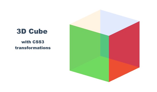
Cube animated using CSS keyframes
Live Demo
Below you can view test the script version. Click the rotation buttons to see the animated turns.
The HTML Code
All you need is a wrapper and a div element for each side. Below the cube I added the links to control the cube rotations.
<div id="wrapD3Cube"> <div id="D3Cube"> <div id="side1"></div> <div id="side2"></div> <div id="side3"></div> <div id="side4"></div> <div id="side5"></div> <div id="side6"></div> </div> </div> <p style="text-align: center;"> <a onclick="turnLeft()">Left</a> <a onclick="turnRight()">Right</a> <br /> <a onclick="flipCube()">Flip</a> </p>
The CSS Styles
I colored the object according to the color scheme of a Rubik's Cube and set a slight opacity. The six sides of the cube are positioned with the transform property.
#wrapD3Cube { width: 250px ; height: 213px ; margin: 20px auto; background-color: #EEE; } #D3Cube { width: 112px ; height: 112px ; top: 50px ; transform-style: preserve-3d; -moz-transform-style: preserve-3d; -webkit-transform-style: preserve-3d; transform: rotateX(-22deg ) rotateY(-38deg ) rotateZ(0deg ); -moz-transform: rotateX(-22deg ) rotateY(-38deg ) rotateZ(0deg ); -webkit-transform: rotateX(-22deg ) rotateY(-38deg ) rotateZ(0deg ); margin: auto; position: relative; -moz-transform-style: preserve-3d; transform-style: preserve-3d; -webkit-transition: all 0.5s ease-in-out; transition: all 0.5s ease-in-out; } #D3Cube > div { position: absolute; -webkit-transition: all 0.5s ease-in-out; transition: all 0.5s ease-in-out; width: 112px ; height: 112px ; float: left; overflow: hidden; opacity: 0.85; } #side1 { transform: rotatex(90deg ) translateX(0px ) translateY(0px ) translateZ(56px ); -moz-transform: rotatex(90deg ) translateX(0px ) translateY(0px ) translateZ(56px ); -webkit-transform: rotatex(90deg ) translateX(0px ) translateY(0px ) translateZ(56px ); background-color: #FFF; } #side2 { transform: rotateY(-90deg ) translateX(0px ) translateY(0px ) translateZ(56px ); -moz-transform: rotateY(-90deg ) translateX(0px ) translateY(0px ) translateZ(56px ); -webkit-transform: rotateY(-90deg ) translateX(0px ) translateY(0px ) translateZ(56px ); background-color: #ffaf1c; } #side3 { transform: translateX(0px ) translateY(0px ) translateZ(56px ); -moz-transform: translateX(0px ) translateY(0px ) translateZ(56px ); -webkit-transform: translateX(0px ) translateY(0px ) translateZ(56px ); background-color: #58d568; } #side4 { transform: rotateY(90deg ) translateX(0px ) translateY(0px ) translateZ(56px ); -moz-transform: rotateY(90deg ) translateX(0px ) translateY(0px ) translateZ(56px ); -webkit-transform: rotateY(90deg ) translateX(0px ) translateY(0px ) translateZ(56px ); background-color: #ed3030; } #side5 { transform: rotateY(180deg ) translateX(0px ) translateY(0px ) translateZ(56px ); -moz-transform: rotateY(180deg ) translateX(0px ) translateY(0px ) translateZ(56px ); -webkit-transform: rotateY(180deg ) translateX(0px ) translateY(0px ) translateZ(56px ); background-color: #1c5ffe; } #side6 { transform: rotateX(-90deg ) translateX(0px ) translateY(0px ) translateZ(56px ); -moz-transform: rotateX(-90deg ) translateX(0px ) translateY(0px ) translateZ(56px ); -webkit-transform: rotateX(-90deg ) translateX(0px ) translateY(0px ) translateZ(56px ); background-color: #f2f215; }
The Script
The script manipulates the rotateX, rotateY and rotateZ values of the transform CSS property:
var cubex = - 22, // initial rotation cubey = - 38, cubez = 0; function rotate(variableName, degrees) { window[variableName] = window[variableName] + degrees; rotCube(cubex, cubey, cubez); } function rotCube(degx, degy, degz){ segs = "rotateX(" +degx+ "deg) rotateY(" +degy+ "deg) rotateZ(" +degz+ "deg) translateX(0) translateY(0) translateZ(0)"; $('#D3Cube').css({"transform":segs}); } function turnRight() { rotate("cubey", 90); } function turnLeft() { rotate("cubey", - 90); } function flipCube() { rotate("cubez", - 180); }
Cube Rotation Animation With Keyframes
Rotating the cube with JavaScript is not the only way of animating the cube. We can use CSS keyframes to set a looping animation.
In this case we need to add the adjustments below to our style sheet. This will smoothly change the rotateY value. Play with the code in JSFiddle.
#D3Cube { -webkit-animation: cubeRotation 5s infinite; /* Safari 4.0 - 8.0 */ animation: cubeRotation 5s infinite; } @-webkit-keyframes cubeRotation { 0% { -webkit-transform: rotateX(-22deg ) rotateY(-38deg ) rotateZ(0deg ); } 50% { -webkit-transform: rotateX(-22deg ) rotateY(-128deg ) rotateZ(0deg ); } 100% { -webkit-transform: rotateX(-22deg ) rotateY(-398deg ) rotateZ(0deg ); } } @keyframes cubeRotation { 0% { transform: rotateX(-22deg ) rotateY(-38deg ) rotateZ(0deg ); } 50% { transform: rotateX(-22deg ) rotateY(-238deg ) rotateZ(0deg ); } 100% { transform: rotateX(-22deg ) rotateY(-398deg ) rotateZ(0deg ); } }
how to draw a 3d cube
Source: https://html-online.com/articles/css3-cube/
Posted by: valentinthaders.blogspot.com
0 Response to "how to draw a 3d cube"
Post a Comment